At WordPress.com, we’re always pushing our platform to do even more so that you can create, design, and publish amazing things with ease. Our newest features go a little deeper into the settings, making them particularly suited to those who call themselves tinkerers. Even if you don’t think of yourself as a pro, get in there and play around anyway! You’re more capable than you think, and if you break something our team can always get it back — we’ve all been there.
And in this case, a little experimentation can reap big rewards. All it takes is a small change or two to make a huge difference in how people see (and interact with) your website.
Let’s jump in and take a look.
Make your site’s buttons pop
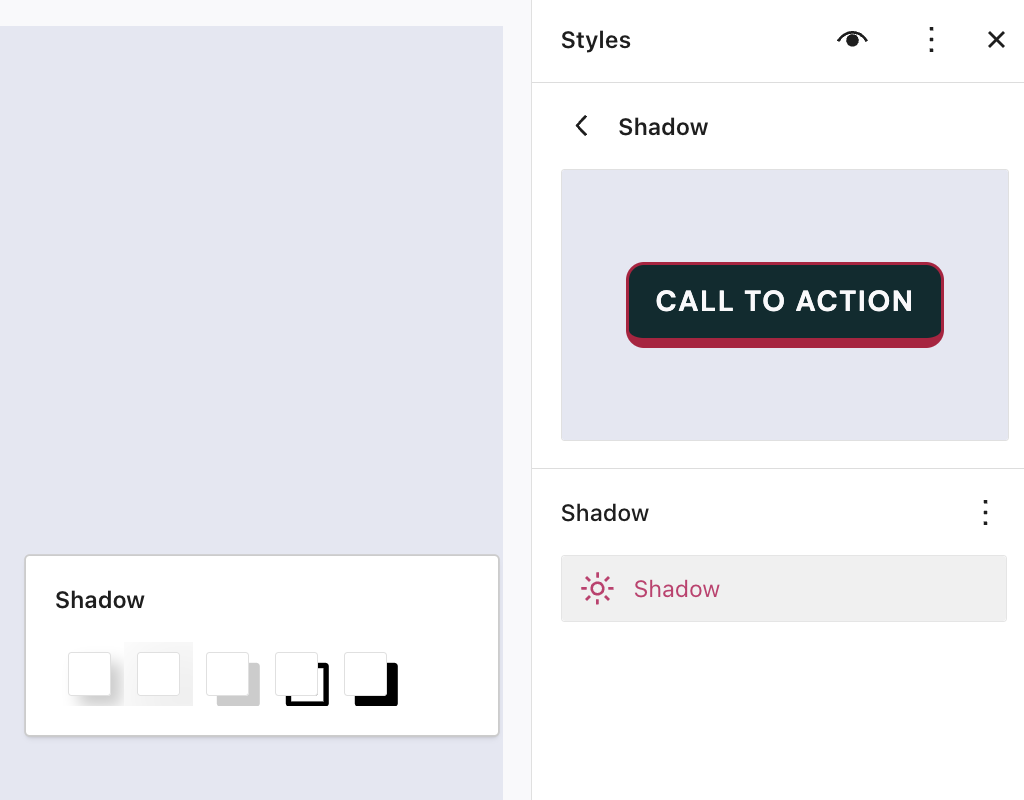
Giving your buttons a shadow effect is an easy and powerful way to give your pages some extra panache. Now, new preset options available in the Styles menu let you apply that across your site.
From the Styles sidebar, click “Blocks,” and then “Buttons.” From there, you’ll see four options for how to style your buttons. This feature is only available on block themes.
When to use this feature: You’re a master of the CTA (call to action) and you put a button at the end of every blog post asking readers to watch a YouTube video, listen to a podcast, or buy a book. You’ve been thinking that those buttons are looking a little stale and flat. Use the new shadow presets to invigorate your default buttons with a depth and freshness that wasn’t there before.
Reuse a beautiful design
Not only can you copy and paste text from one block to another, you can now copy the entire styling of a block — colors, typography, and anything else — and paste it to another block of the same type.
From a block’s settings menu, select “Copy Styles.” Then once you add a new block, select “Paste Styles” from the settings menu to transfer all those design goodies.
When to use this feature: You’ve spent some time playing with gradients and type settings to make a Quote Block look really nice, and it’s paid off — now you want to bring that primo styling over to a Quote Block on a different page. Rather than recreating the steps you took, simply use “Copy Styles”/”Paste Styles” and get a gold star for efficiency.
Give readers a sticking point
A “sticky” component on your website is a piece of content (often a header + menu, though not always) that stays stuck at the top no matter how far down you scroll through a page or post. It’s a handy feature for visitors to your site, especially on mobile, where scrolling back up to a menu can be annoying.
There are other uses as well, such as an important announcement or promotion that you want visible at all times.
However, only a group can be made sticky rather than any individual template part. So you’ll first wrap your desired sticky blocks in a group, select that group, then access the “Sticky” option from the settings sidebar.
When to use this feature: Your website features long pages or posts that require a lot of scrolling. Maybe you’re a baby name consultant and have numerous lengthy lists of names. Utilize a sticky header and menu so that visitors don’t have to scroll all the way back up in order to quickly access the next category of names to peruse.
Twice as nice: copy your entire site!
Are you a professional in the web-building space? We’ve launched a new feature that allows you to easily copy the entirety of a site. Once you create your base template site, you’ll be able to spin up new client sites without starting entirely from scratch.
An important note: copying a site creates a new plan as well. For instance, copying a business site creates a new business plan at the same time.
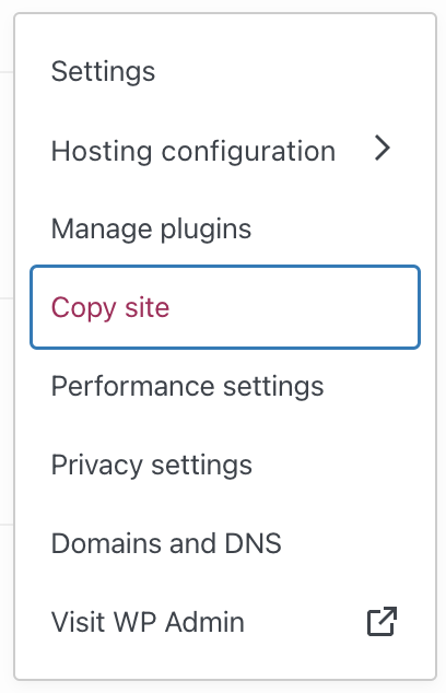
From the wordpress.com/sites dashboard, click the three-dot menu, hit “Copy site,” go through a couple confirmation steps, and you’ll be set. This feature is available on Business and Commerce plans with Hosting Features active.
When to use this feature: You’re a solopreneur website builder and you often use previously built sites as inspiration for current builds. If you’re working on a new site and thinking about using a framework or feel that you’ve already created, copy the site with a single click and start the project with some of the work already done.
In Case You Missed It
If you missed our other recent updates, below is a quick snapshot.
A new mobile experience for WordPress.com

Our new and improved Jetpack mobile app offers everything you need to WordPress on the go.
Professional design, without a designer

This primer on Styles gives you the lowdown on making your website pop in just a few clicks.
A new home for WordPress.com courses

Our courses have a new home at WordPress.com/Learn. The best part? All the courses are totally free and there’s no registration needed.
A more diverse stock photo library

Cocoamattic ERG, an employee resource group at Automattic, partnered with Nappy.co to release a collection of 90+ beautiful photos of Black people interacting with technology.


