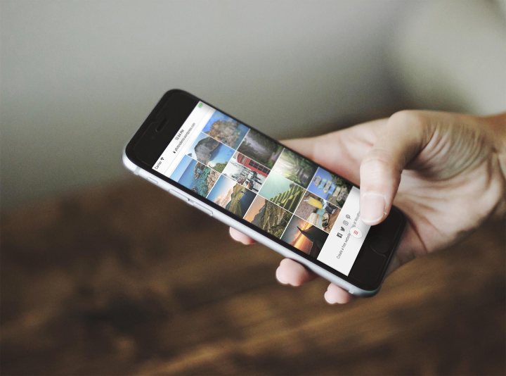
Today we’re happy to introduce Photos, an image-centric theme with a clean layout and a design that showcases your favorite snapshots.

When we designed Photos, we put extra care into making it look and feel great on mobile devices. But that’s only one of the theme’s highlights — here are a few others.
Photos first: Photos features a familiar three-column grid to display your photos on your blog’s homepage, archive pages, and search results. The full-width grid appears on smartphones and tablets. It scales up to a fixed-width grid on desktop and laptop displays.
Mobile navigation: When visitors view your site on a mobile device, the menu button is fixed at the bottom of the page, closer to your thumbs. The menu then slides up from the bottom, keeping your site-navigation items within easy reach.

Standard fonts: Photos uses system fonts — fonts that are already available on mobile devices and computers — rather than loading its own custom fonts. This reduces page-load time, and benefits people browsing your site on mobile devices or slower internet connections. Like in any other WordPress.com theme, you can always change the font using the Customizer.
No sidebar: For a more consistent experience between desktop and mobile screens, Photos has a single-column, no-sidebar layout. This helps sites retain the same look and feel regardless of the device your visitors use to view it.
You can learn more about Photos by checking out the Showcase page or the theme’s demo site!
