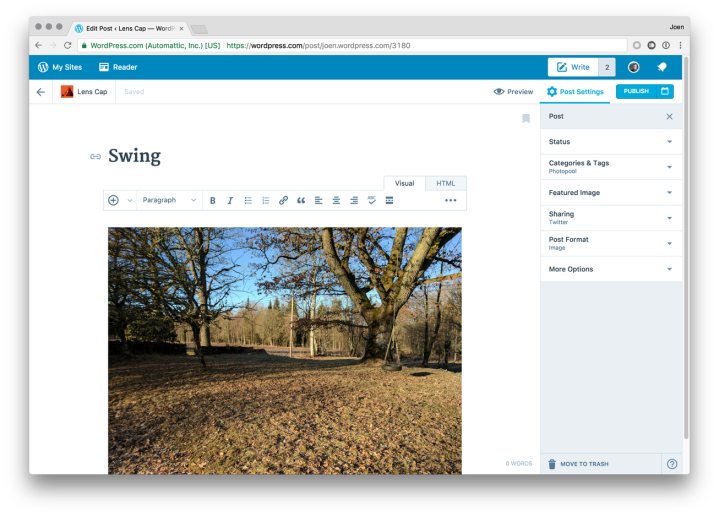
Today we’re proud to unveil some design changes to the WordPress.com editor. It has the same great features you’ve come to expect, but with a cleaner, more refined experience — and a few new improvements, like a distraction-free writing mode.

Welcome to our new distraction-free writing experience. We hope you enjoy it.
To give you a tour, I chatted with the two people who helped to create it. Joen Asmussen and Matías Ventura are two Europe-based computational designers at Automattic who have been designing different aspects of the WordPress.com experience over the past six years. It’s certainly come a long way from its very first prototype:

The editor as it looked with the launch of the WordPress.com redesign, late 2015.
… and we also know there’s still a long way to go!
JM: Much of what we know about design is grounded in experiences in the physical world, and you can learn a lot about a designer from the objects that they admire. I understand that your favorite designed object is a … door handle?
Joen: Hah, yes indeed! Or perhaps clarification is needed — one of my favorites. A guiding principle of mine is that the best design is invisible. It is functional to the point that you forget how it works: you just use it. The door handle is a design that has been honed for who knows how long — it’s easy to forget that it was once designed from scratch. And everyone knows how to use a door handle. That makes it a great design.
JM: What inspirations do you take from those objects to the work you bring to a digitally based product?
Matías: I think that same clarity of purpose and the ability to adapt to whatever complex ideas a person wants to express or achieve is something digital tools should seek to provide. The WordPress editor is a good example of this goal, because it needs to be immediately evident for someone who wants to just write yet also capable of fulfilling a varied spectrum of needs.
Joen: Products are never finished, and there are always aspects that can be refined or improved, the ultimate goal being to make using the product easier, faster, second-nature. If we can refine the editor to the point that its usage becomes second nature, we’ll have something great.
***
Today, we know that design is more about iteration than it is about perfection, but that absolutely does not stop designers like Joen and Matías from iterating with the spirit of perfection. And with the new set of refinements launching today on WordPress.com, one can definitely see that commitment to craft in action. Those refinements include:
- A new distraction-free writing mode.
- Your recent drafts available in the top toolbar.
- Better clarity on the saved state of a post.
- Permanently visible publish/preview buttons.
Together, we hope they will they help fine-tune the writing experience. (And if you have a self-hosted WordPress site with the Jetpack plugin, you’ll also be able to use the new editor features.)

The new editor experience we are launching today.
JM: What are you most excited about with this improved writing experience, and what do you hope most for the writer when they’re using it?
Joen: Everything has a right place. In this iteration, we’ve tried to find those places for the preview and publish buttons, as well as the post settings. By making the buttons permanently visible and the sidebar optionally toggled, my hope is that the combination will provide a seamless flow for both the person who just wants to write, as well as the person who needs to configure their post settings.
Matías: I’m glad we were able to bring back the notion of a distraction free environment that puts the content in the center. I’m also fond of the recent drafts menu next to the “Write” button, as it provides a quick way to carry on with your unfinished posts. These editor refinements have the potential to let your work on WordPress keep you deeply in the productive state of flow.
JM: Are there any other design evolutions or revolutions coming down the pipeline for WordPress.com that you can speak about?
Joen: There’s a group of us focusing on editor improvements right now in the WordPress community at large. The key bits are embracing “blocks” as a way to attach more advanced layout options to each section of a post, so people can easily and quickly write richer articles than they could in the past.
Matías: We want to make it easy, and pleasurable, to create any kind of content with the editor. I believe that the essence of design is about the intersection of culture and technology — and we’re doing just that with this improved writing experience. It is a privilege that this effort is being done within the diverse open source community of WordPress, it means you not only own your content but you also have ownership over the tools with which it is created.
JM: Thanks so much for your time, Joen and Matías! I’ve enjoyed using the new distraction-free writing experience and can tell you I definitely got this post finished a little faster than usual. You’ve given me new focus.


