
A Redesigned Reader Experience
If you’ve recently visited the WordPress.com Reader, you may have noticed some aesthetic improvements. Today we’re giving you a quick visual tour of those changes and inviting you to check out our new and improved Reader if it’s been a while. Let’s jump in!
Streamlined Consistency
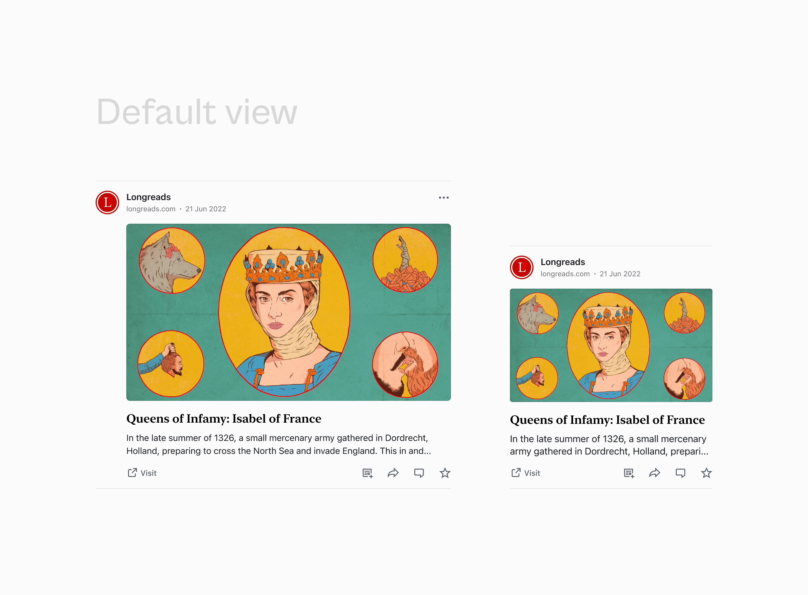
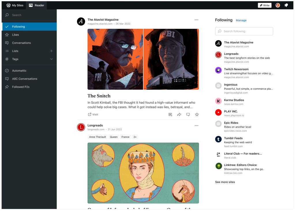
Each of the individual cards within the reader have been redesigned to better highlight the content you’re sharing with your audience. Images and videos have been enlarged, padding and margins have been improved, and the general layout has been adjusted across all content types to provide a consistent reading experience.
Updated Layouts
A number of the layouts within the WordPress.com reader have been streamlined on desktop and mobile web to make browsing and discovering new content easier.
Grid Aligned
You might not notice this at first glance, but a consistent grid has been applied to the entire layout to make it easier for your eyes to scan content and scroll through your entire feed.
First of Many Improvements
This is the first of many improvements that we hope to make to the reader over the next year. If you have additional feedback on improvements we might make, please share them in the comments below and stay tuned for additional updates.
- December 12, 2022
- reader

Awesome, I love WordPress improvements.
LikeLiked by 7 people
That’s nice to see. I really love this
LikeLiked by 6 people
I’m liking things so far.
LikeLiked by 8 people
Looking good!
LikeLiked by 11 people
Great
LikeLiked by 1 person
Last week’s changes were more noticeable than the ones made in October (I think!) and while the overall experience still seems good, I would love the option of switching off the distracting ‘Followers’ column on the right hand side 😉
Compliments of the season and thanks for all the good work behind the scenes!
LikeLiked by 8 people
Thanks for the kind words and feedback! An option to switch off the right sidebar is not a bad idea! I’ve added it to our list of follow up issues to consider.
LikeLiked by 6 people
I keep getting emails from you. Is this because I have an old blog that I had forgotten about?? Lol
Sent from my iPhone
>
LikeLiked by 3 people
Hey there, please reach out to us via help@WordPress.com and we’ll do our best to track that down and work with you on next steps.
LikeLiked by 4 people
Thank you for constantly trying to make WP better. I appreciate you. 👍🏽❤️
LikeLiked by 8 people
I’m not at all pleased about sites I’m following being listed down the RHS, cluttering up my screen. I don’t need and don’t want this. Please stop imposing your ideas of what *you* think is a good idea on me, who hates the idea. If you do stuff like that you should provide for me to turn that feature off. I hate it and have already complained through the Help Chat. If you keep doing this sort of thing I’ll be leaving WordPress.
LikeLiked by 4 people
Whoa it’s not that serious
LikeLiked by 2 people
I can tell you feel strongly about this. Thanks for sharing your feedback. Adding a way to hide the right sidebar is definitely an option we’ll consider adding.
LikeLiked by 5 people
👍
LikeLiked by 2 people
Yes, this is true Dave! Thanks for your acknowledgement. Please, please do consider, and naturally I hope the team will ‘do’. Cheers.
LikeLiked by 3 people
Tip: One way you can achieve this right now is by reducing the width of your browser window. If you reduce the width enough, the right sidebar disappears into a tab at the top. That’s not a long-term solution, but I figured it might help in the short-term. Cheers!
LikeLiked by 2 people
I had noticed that Reader looks better lately. Thanks.
I have 2 suggestions for additional improvements; will put them in separate comments.
LikeLiked by 3 people
Hey there, thank you for that feedback and the time it’s taken to put that together – we really appreciate the insights there.
LikeLiked by 5 people
**** Hide button ****
In addition to the buttons for visiting or liking posts displayed by Reader, it would be good to have a Hide button. I am often using Reader in situations where I could be interrupted. I need to postpone reading or commenting on posts that are longish and thought-provoking. By the time I can give such a post the attention it deserves, it is far down and hard to find, in the chronological list presented to me by Reader. If I could hide recent posts that I have already finished considering, it would be much easier to find those that I had to postpone considering.
LikeLiked by 5 people
**** Excerpts ****
If the author of a post chooses to write an excerpt, then the text of the excerpt should be the text that Reader displays, no more and no less. A few years ago, I was shocked to find that Reader always ignored my excerpt and insisted on displaying the first few lines of the body of any post that had (and needed!) an excerpt, no matter how inappropriate those lines might be.
When I complained about this perverse behavior in 2019-04, I was told that we are stuck with it. Since Reader is getting a lot of work anyway, maybe that fatalism can be revisited. BTW, it has been a while since I posted something that needed an excerpt. If the bug has already been fixed w/o fanfare, I am grateful to whoever did it.
LikeLiked by 4 people
Good news on this front. This has been addressed with these recent changes. If the author has added a custom excerpt, the reader will default to this content. If you see something contrary to this, please get in touch. Thanks for the feedback.
LikeLiked by 3 people
Wow this is great
Keep it up we love you 💓
LikeLiked by 7 people
🥰
LikeLiked by 2 people
Thank you for the work towards improving our experience with WP reader.
If I may suggest one thing:
I remember that at some point you have introduced something like a card bundling multiple daily posts from the same blog; I don’t see it applied ( maybe due to the time limit between posts?).
It would be helpful to have that as I find that my Reader clutters from prolific writers, hence making it a chore to find the posts from the ones who write less frequently.
LikeLiked by 5 people
Thank you for that feedback!
LikeLiked by 1 person
O love the Reader. I Just want the “save” Button that we have in the APP in the browser version.
LikeLiked by 8 people
+1 And have them synced so that when I open the Reader on the web I can catch up on what I saved in the app and vice versa.
LikeLiked by 2 people
Love this❤❤
LikeLiked by 4 people
Wow! This is awesome!
LikeLiked by 3 people
Further to Mellow Curmudgeon’s request for a ‘hide’ button.. I have the same problem outlined by MC. Posts I don’t have time for (but do want to read) disappear way down the list very fast and are hard to find again. While I like the new presentation of posts in the Reader, each entry appears to take up significantly more screen space than previously. For this reason I’d like to be able to toggle between displaying posts the new way and the old way, the old way being quicker to scroll down. [Note: my alt idea to MC’s would be.. the ability to ‘pin’ posts at the top of the feed for ease of retrieval.] Thanks.
LikeLiked by 2 people
This is a nice improvement by WordPress
LikeLiked by 4 people
Looking good
LikeLiked by 2 people
Thanks for the improvements, sadly the new reader doesn’t work in my default Opera browser. I don’t have activated adblockers.
LikeLiked by 3 people
Hey there, many thanks for that report – may we ask you to reach out to us via https://wordpress.com/help/contact so that we can take a look. It may be useful to also take some screenshots, as this will point to some clues as to what’s happening there. https://snipboard.io/is a good tool to use for that.
LikeLiked by 4 people
hello
LikeLiked by 1 person
Nice💓❣️💓❣️
LikeLiked by 2 people
That’s a feasible and creative change in here♡
LikeLiked by 2 people
It’s been a long time since I used WordPress Reader. Last time I did, some websites don’t allow you to view the entire post. Some RSS clients let you fetch the complete post in one click, without leaving the app. Such an option would be nice in Reader.
LikeLiked by 1 person
great job
LikeLiked by 2 people
WP’s Reader has all the potential to be what Google Reader was going to be: a social network with relevant content. Substack and Tumblr have moved in that direction, but here the potential seems greater.
LikeLiked by 3 people
this is great to see the redesign of reader experience
LikeLiked by 3 people